


HIGHLIGHTS
Where Design Blooms: A Celebration of Nature's Essence in a Sophisticated Bottle.


OPPORTUNITY
Consumers are increasingly drawn to fragrances that align with their values, healthy ingredients, ethical sourcing, and transparent branding.
Pain Points
There’s a gap in designs that evoke both simplicity and luxury, balancing modern appeal with timeless elegance.
Many existing women perfume commercials focus more on the image of a model and fail to resonate with actual scent or brand’s identity / story.
Design Goals
Authenticity
Elevate fragrance design with visuals that emotionally connect and leave a lasting impression.
Captivating Narrative
Forge A Connection
Create a distinctive, memorable bottle that evokes calmness and beauty.
Capture the essence of tranquility and natural beauty through simple, genuine design.

The Design Journey: From Concept to Creation of Serene Blossom

The purple color palette conveys luxury and sophistication..
The use of purple suggests a complex fragrance and piques curiosity.
This purple is versatile enough for anything from packaging to websites.
DESIGN PROCESS
Colors & Mood Board
I’ve always admired design that blends classic elegance with modern simplicity. For this project, I was inspired by the understated luxury of Louis Vuitton’s fragrance bottles, clean lines, subtle colors, and no unnecessary embellishments.


Logo & Font Selection
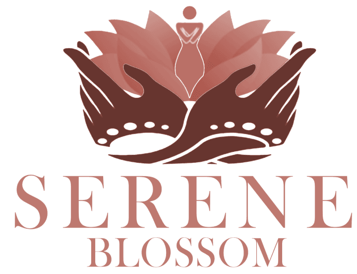
The logo for Serene Blossom embodies tranquility and natural beauty. A lotus flower, gently held graceful hands, symbolizes peace and elegance.
I chose a deep purple gradient for luxury and mystery, with a hint of pink to add a modern touch. The Baskerville typeface brings timeless elegance, echoing vintage botanical illustrations while keeping the design both classic and contemporary
Bottle Design
My first bottle design was minimalist, but it felt too similar to other perfume bottles. I redesigned it to keep the simplicity while adding elegance and uniqueness. The refined shape and subtle curves stand out against the more elaborate designs often found in women’s perfumes.
I’m really pleased with how the final design, materials, and colors come together with the logo. I even experimented with a black-and-white version of the logo to see how it complemented the overall design.


I created two renders for the bottle, this one using Cycles in Blender for a more realistic approach.
I chose pink glass for a soft look, paired with a metallic cap for a modern touch. The transparent pink liquid and subtle silver lining add elegance.
Blender’s EEVEE engine helped create a stylized look for the animation and commercial, while keeping the workflow fast and efficient.

I chose Eevee for the commercial to balance speed and style within the project’s timeframe.

This project reinforced how color plays a crucial role in shaping brand perception. Through exploration, I found that the purple gradient perfectly captured the luxury and intrigue I wanted to convey
Power of Visual Storytelling
Bridging Product and Brand
The logo design aimed to blend classic and modern elements. By pairing the traditional Baskerville typeface with a contemporary color palette and a clean illustration style, I achieved a harmonious balance between the two
Creating the animation and commercial for "Serene Blossom" showed me how to take a still image and make it come alive. I learned so much about using movement, pacing, and visual effects to tell a story and make the brand even more captivating.
Static Design to Life
RETROSPECTIVE
A Journey of Fragrance and Storytelling that Taught Valuable Lessons
Key Takeaways
HIGHLIGHTS
Where Design Blooms: A Celebration of Nature's Essence in a Sophisticated Bottle.
OPPORTUNITY
Consumers are increasingly drawn to fragrances that align with their values, healthy ingredients, ethical sourcing, and transparent branding.
Pain Points
There’s a gap in designs that evoke both simplicity and luxury, balancing modern appeal with timeless elegance.
Many existing women perfume commercials focus more on the image of a model and fail to resonate with actual scent or brand’s identity / story.
Design Goals
Authenticity
Elevate fragrance design with visuals that emotionally connect and leave a lasting impression.
Captivating Narrative
Forge A Connection
Create a distinctive, memorable bottle that evokes calmness and beauty.
Capture the essence of tranquility and natural beauty through simple, genuine design.
The Design Journey: From Concept to Creation of Serene Blossom
The purple color palette conveys luxury and sophistication..
The use of purple suggests a complex fragrance and piques curiosity.
This purple is versatile enough for anything from packaging to websites.
DESIGN PROCESS
Colors & Mood Board
I’ve always admired design that blends classic elegance with modern simplicity. For this project, I was inspired by the understated luxury of Louis Vuitton’s fragrance bottles, clean lines, subtle colors, and no unnecessary embellishments.
Logo & Font Selection
The logo for Serene Blossom embodies tranquility and natural beauty. A lotus flower, gently held graceful hands, symbolizes peace and elegance.
I chose a deep purple gradient for luxury and mystery, with a hint of pink to add a modern touch. The Baskerville typeface brings timeless elegance, echoing vintage botanical illustrations while keeping the design both classic and contemporary
Bottle Design
My first bottle design was minimalist, but it felt too similar to other perfume bottles. I redesigned it to keep the simplicity while adding elegance and uniqueness. The refined shape and subtle curves stand out against the more elaborate designs often found in women’s perfumes.
I’m really pleased with how the final design, materials, and colors come together with the logo. I even experimented with a black-and-white version of the logo to see how it complemented the overall design.
I created two renders for the bottle, this one using Cycles in Blender for a more realistic approach.
I chose pink glass for a soft look, paired with a metallic cap for a modern touch. The transparent pink liquid and subtle silver lining add elegance.
Blender’s EEVEE engine helped create a stylized look for the animation and commercial, while keeping the workflow fast and efficient.
I chose Eevee for the commercial to balance speed and style within the project’s timeframe.
This project reinforced how color plays a crucial role in shaping brand perception. Through exploration, I found that the purple gradient perfectly captured the luxury and intrigue I wanted to convey
Power of Visual Storytelling
Bridging Product and Brand
The logo design aimed to blend classic and modern elements. By pairing the traditional Baskerville typeface with a contemporary color palette and a clean illustration style, I achieved a harmonious balance between the two
Creating the animation and commercial for "Serene Blossom" showed me how to take a still image and make it come alive. I learned so much about using movement, pacing, and visual effects to tell a story and make the brand even more captivating.
Static Design to Life
RETROSPECTIVE
A Journey of Fragrance and Storytelling that Taught Valuable Lessons
Key Takeaways
My Role
Visual Designer - 3D Design, Branding, and Concept Development
Tools - Blender , Photoshop , Lightroom , After Effects, Figma
Timeline
October - November 2023
Overview
"Serene Blossom" is a marketing and design project created in just five weeks, blending elegance with modernity to tell a story of tranquility and natural beauty.
The design process began by exploring how these themes could translate into a tangible product. The result: a sleek, minimalist fragrance bottle paired with a delicate logo featuring a lotus flower, symbolizing peace and grace.
Through 3D modeling, animation, and video editing, I crafted a cohesive visual narrative that brings the brand to life—simple, serene, and undeniably captivating.
My Role
Visual Designer - 3D Design, Branding, and Concept Development
Tools - Blender , Photoshop , Lightroom , After Effects, Figma
Timeline
October - November 2023
Overview
"Serene Blossom" is a marketing and design project created in just five weeks, blending elegance with modernity to tell a story of tranquility and natural beauty.
The design process began by exploring how these themes could translate into a tangible product. The result: a sleek, minimalist fragrance bottle paired with a delicate logo featuring a lotus flower, symbolizing peace and grace.
Through 3D modeling, animation, and video editing, I crafted a cohesive visual narrative that brings the brand to life—simple, serene, and undeniably captivating.

SERENE BLOSSOM
SERENE BLOSSOM
Brand Design - November 2023

