
My Role
UX Designer & Researcher— Interaction Design , Information Architecture, Market Analysis , High Fidelity Design
Team
Christopher Torres, UX/UI Lead
TimeLine & Status
5 months , Shipped
Overview
Marketeq needed a billing system built from nothing — a settings experience for clients to manage payments, plans, and contracts, alongside checkout flows for every service the platform offers. I led end-to-end design across payment management, invoicing, subscriptions, and the checkout experience for individual contracts, team contracts, and plan upgrades.
The result: a fully documented, production-ready billing system covering every state, edge case, and data limitation across the platform.


Billing is Complex.
Starting with structure
Managing billing isn't just a feature — it's the control center of every financial decision a client makes on the platform. Before a single screen was designed, we mapped the full architecture to understand what users needed to see, manage, and act on.
The site map started as our foundation and evolved as the system grew in complexity. What you see here is the final version.

Site Map of the Billing settings
A multitude of constraints
The billing system needed to handle various use case with a similar design lanugae across the board. The most strenious contstrint is the handling of componets with diffrent use cases in the case of a user purchasing a Team services as opposed to a individual contractor .
Same language, different stakes. Individual contracts, team contracts, plan upgrades. Wildly different logic, one design system. Every component had to flex without breaking.
Every pixel had a financial consequence . An unclear number, stale state or missed error state isn't a just usability issue in a billing system. It's a trust issue.
Designing without a ceiling. No locked states, no dead ends. Users always needed a path forward. That constraint shaped every decision before a single screen was drawn.

Our Design Principles
Financial Transparency
Users always understand what they owe, why, and what changes before it happens.
Scalable Clarity
The System needed to be designed for the user with 1 card and the the user with 20+ active contracts simultaneously
Edge-Case Coverage
Every error, every failure, every edge state is designed - Not deferred
Same Consistency
Same component , same behavior , same language across every billing surface
Finding the Answer.
Studying the best to build the best.
This process was consistent across every screen in the sprint. Using Payment Methods as an example — I collected screenshots from industry leaders and Competitors including Walmart, Google Pay, eBay, Amazon, Meta Pay, Fiver, upwork and more, noting their features, patterns, and structure to inform what Marketeq's billing system needed to do.


Payment method Screens for PayPal and & Ebay
Card sorting the right features.
With screenshots collected, I card sorted the features identified across all platforms into three categories — Must Have, Nice to Have, and Will Not Have. This allowed us to quickly align on priorities and make deliberate decisions about what belonged in Marketeq's payment methods experience before a single wireframe was drawn.
Card sorting features for the manage payment method screen
Putting them in groups
Once the features we wanted were card sorted , i would collectively group those features/sections and put them into groups so i can audit them closely . See what works and doesn't . You’ll see this in the next section.

Group of must have features for the Plan Management Screen
Evidence to Execution
Choosing the right Layouts
Layout decisions were always the starting point. Using Payment Methods as an example — knowing we wanted a list view, the question became whether to go horizontal, vertical, or grid. A crucial call, since it would define the entire layout and how users interact with their cards. I audited both directions, mapped the pros and cons, and determined the best path forward.

Horizontal Layout from Walmart
Much more visually appealing and resembles wallet applications
less cognitive overload to just see 2-3 cards at a time.
Difficult to scale when a user has 15+ payment methods
wouldn't be able to add a dedicated card details section , would have to create a seperate popup or page.
Unlike the vertical layout , you would need lots of interaction to find a specific card

Vertical layout from Amazon (Winner)
Scannability is much better. This can handle 20+ cards in a list and users can see all the cards with minimum interaction.
Opens up the right panel for a large additional card details section that includes like active contracts and billing address
Edit, remove, and set default actions remain consistently accessible with the right side open.
Stacking rewards, balances, and key actions like adding a payment method crowds the left side — it shouldn't be buried between two sections.
Likes and Dislikes of each Micro-Feature
With screenshots collected and grouped by feature area, I annotated each one directly — green rectangles for patterns worth keeping, red for anything that created friction or failed at scale. Every observation was compiled into a master microfeature list per feature group. The goal: implement as many valuable microfeatures as possible, optimized for our context. More coverage meant a more considered, complete design.


Add payment method — prominent and accessible
Amount of payment methods header — instant inventory awareness
Card issuer logo visible as well as the last 4 digits in the card
Cardholder name and expiry surfaced on the card
No default card or expiry state indicator in the list
Carousel — can cause a lot of friction when searching for a specific payment method


Large card visual — gives the card a sense of identity, feels premium
Expiration date & billing address clearly shown
Update, Remove, set as preferred card actions are accessible on the same screen . Set as preferred offers a clear explanation of what it does.
"Give it a nickname" feels like filler — takes up prime real estate for a low-priority action
Button/action layout is awkward — Update, Set as preferred, and Remove are scattered with explanatory text breaking up the hierarchy, makes it hard to scan
Everything Had a Reason.
Every decision on this screen was validated before it was designed. Dozens of platforms audited, every microfeature annotated, every pattern either adopted, rejected, or improved for our context. The audit didn't inform this screen — it built it.


Immediate orientation Total Count, primary action, and help access above the fold. The first question a user has shouldn't require hunting.
A list built for scale Twenty-one cards, one clear default, active contracts per card. The carousel couldn't handle this. The vertical list could — every detail on each row answers a question the user was already asking.
Space that works The detail panel isn't decoration. Card identity, billing address, active plans — concepts pulled from multiple platforms, none of which used the space well. We did.
One screen, one decision Update, Set as Default, Remove — consolidated and immediate. Every platform we audited made users work for at least one of these. That was a deliberate problem to solve.


Every action needed a response.
Every one of these screens needed a modal behind it. Adding a card, removing one, setting a default, each action needed its own flow, holding up no matter what state the account was in. Before designing any of it, I looked at how Meta, eBay, and Walmart handled the same moments: confirming something irreversible, explaining what happens next, walking someone through a multi-step decision. That set the bar.
The principle behind all of it: never corner someone into two options just to move them along. Every decision point had to give users a real way to change course, not a confirm button dressed up as a choice.

User flows for removing Card
Active Payments
Here's that design philosophy at work. If a card has active contracts or pending payments, removing it isn't a dead end. Users see the impact upfront: payouts on hold, contracts paused, the actual dollar amounts affected. Then they choose, replace the card, or remove it and add a new one. No locked accounts, no restricted access.

User flows for replacing Card
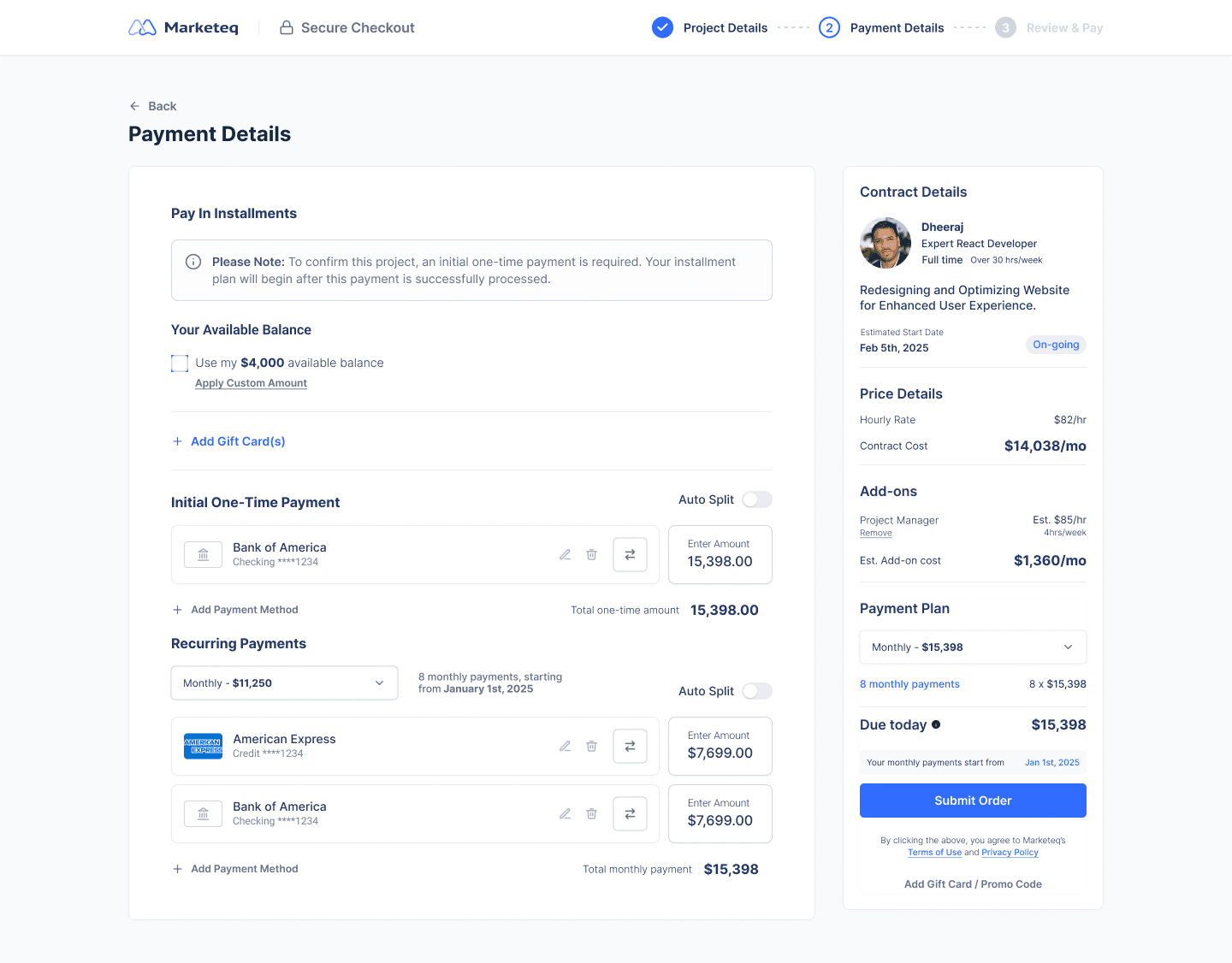
Three purchase types. One system.
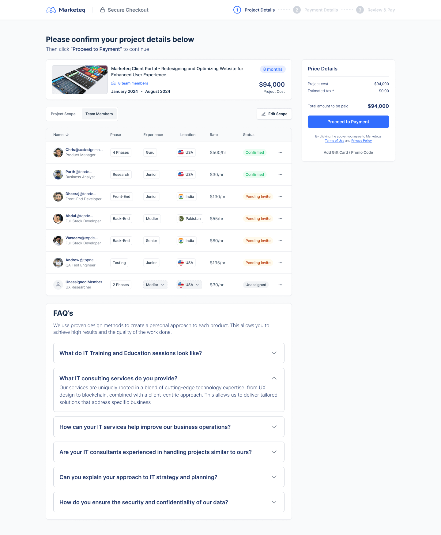


Main Project card
Adapts across all three purchase types
Ongoing contracts have no fixed end date — duration display needs to account for both
Contractor/team name, role, hourly rate, estimated start date




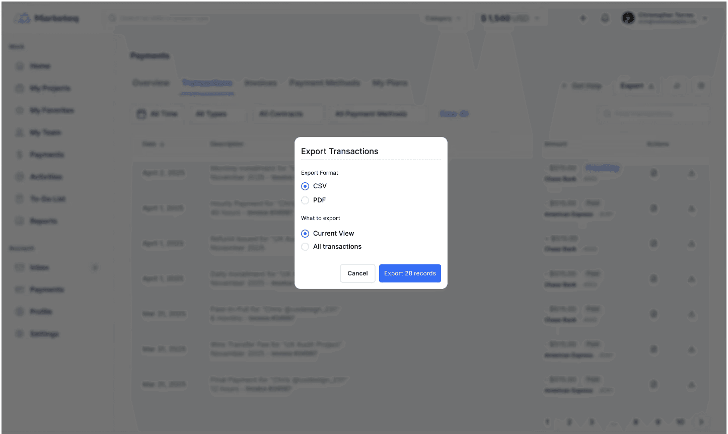
DL # 08 — No export scope confirmation
Export doesn't communicate whether active filters are applied
Needs a pre-download confirmation showing record count
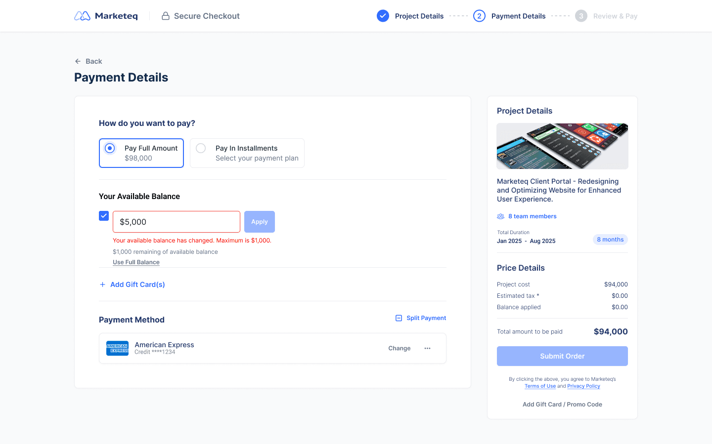
DL #01 — Stale available balance
Balance is fetched at page load — can change mid-session before submission
If balance drops, submission is blocked and inline error reflects the updated maximum
Edge Cases
Twenty-five edge cases surfaced across the billing and checkout system — error states, rejected offers, expired cards mid-split, flows that didn't exist yet. Each one was verified for accuracy, then designed.

EC #23 — Unavailable refund method
If the original payment method is removed before a refund processes, there's no fallback state
Refund routes to account balance and a banner confirms the credit
EC#01 — No loading state on submit buttons
Without a loading state, users have no feedback that their payment is being processed — leaving room for duplicate submissions
State on the button and a connection loss banner prevent users from submitting twice

What I Learned.
Looking back before moving forward.
Documentation revealed the gaps
Writing edge cases and data limitations surfaced decisions I'd overlooked in the designs. I didn't know what I'd missed until I had to write it down.
Business comes first sometimes
Some features that would've helped users had to stay off the table. The right answer isn't always the most generous one.
Designing for freedom is harder than control
No locked states, no dead ends. Keeping every path open without creating chaos was a different kind of design problem than I'd faced before.
Earn the change before you make it
Working inside an existing system meant adjusting first, redesigning second.