

VISONARY
VISONARY
VISONARY
VISONARY
UX/UI- April 2024
My Role
Visionary is a mobile application designed to empower visually impaired students and professionals in achieving career success. Recognizing the unique challenges faced by this community in the job market and workplace, Visionary provides a comprehensive platform that combines practical tools with a supportive community.
Team
Timeline
Overview
UX/UI Designer and Researcher - Interaction Design , Visual Design , Prototyping , User & Market research
Tools - Figma , MAXQDA , Mirro
Marcela Fernandes Cazares
February - April 2024


HIGHLIGHTS
Empowering independence for the blind and Visually impaired
An app for a More Inclusive World .
OUR MISSION

Lack of knowledge about assistive technology leads to underestimating the capabilities of blind workers.
Unconscious bias creates barriers for qualified blind candidates by focusing on limitations instead of skills.
PROBLEM
“Despite my degrees , my education, my background. There have been times where I’ve been told “Well you're blind ,you can’t do this.””
—Juan Hernandez, Software Enginener
Empowering Success
Bridging The Gap

Mobile Ally
PAIN POINTS


Job Search & Assistance

Accessibility Resources & Tools

Privacy & Profile

Professional Networking
& Community Building
For our Data Collection we read and reviewed post from an online reddit group called “R/Blind”.

RESEARCH
3 Video's
THEMATIC ANALYSIS
KEY THEMES
Frequency of Themes
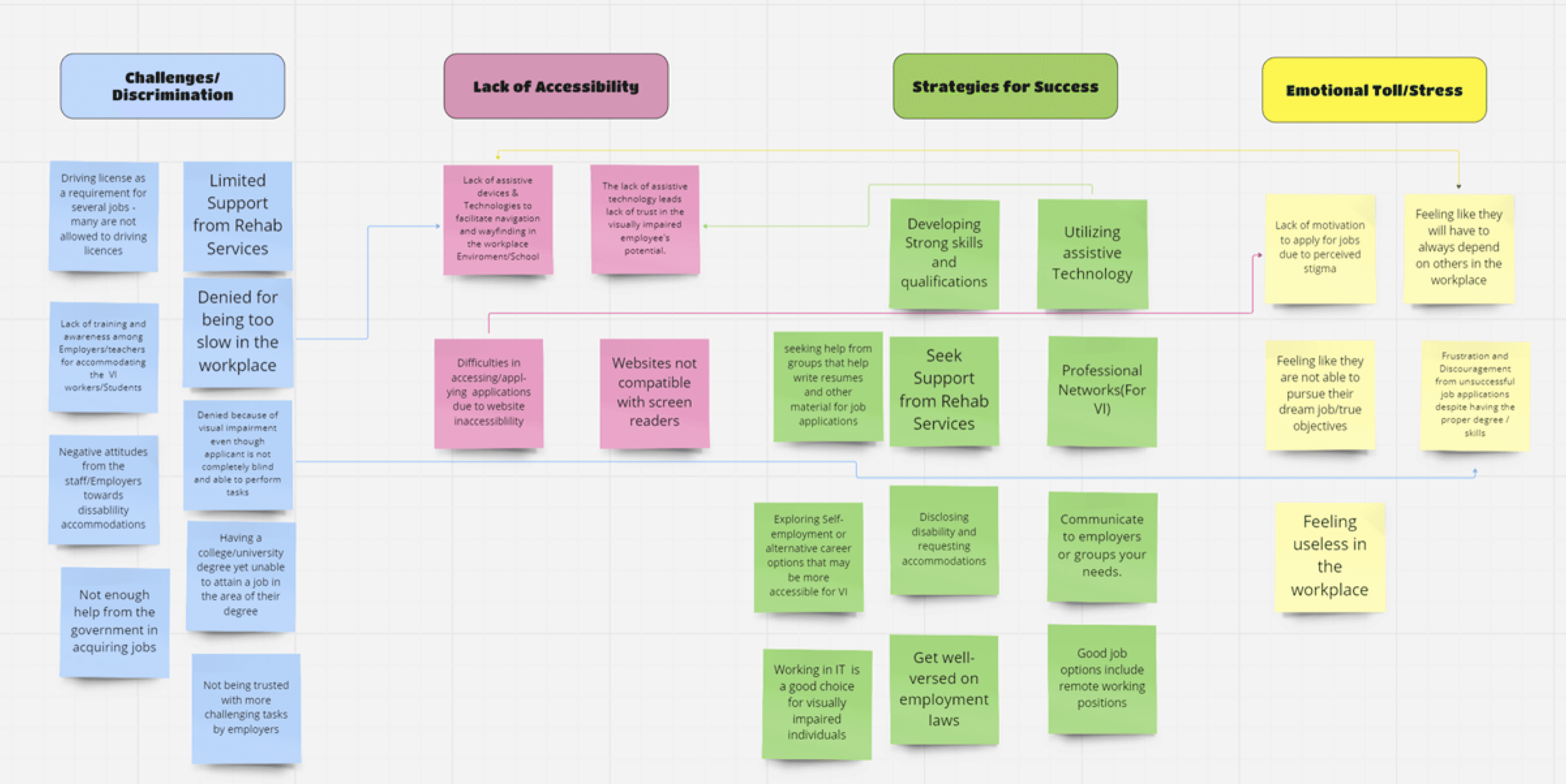
Affinity Diagram
Competitor Analysis
Design Requirements
40 Reddit Posts
Strategies For Success
Challenges Faced
Assistive Technology
Simple and accessible interface.
Lacks customization options to personalize user experience
Text and photo recognition is a valuable feature for users that are visually impaired
Has offline functionality which allows certain features like product scanner to work without internet
Although UI is simple it is clunky and can be quite Laggy at times .
General image scanning can be quite inaccurate
High contrast design and simple layout with easy to access buttons and functionality .
It integrates voice control, supports common screen readers, and uses AI to describe items and environments.
Connects Visually impaired individuals with sighted volunteers for real time assistance. This is crucial for everyday tasking.
The core functionality relies on volunteers to respond .
Lacks user customizations options
Does not help blind individuals getting a Job or applying for one.


BE MY EYES
SEEING AI


Visionary addresses limited job opportunities and accessibility barriers for visually impaired individuals, emphasizing assistive technology. It also highlights the importance of networking, self-advocacy, and skill development for career success.
We determined that 'Be My Eyes' and 'Seeing AI' are the most frequently used apps among the visually impaired.
The affinity diagram revealed key challenges for visually impaired individuals, including discrimination, accessibility, and emotional well-being. It also highlighted the importance of skill development and support systems for career success.

The overall design and wireframes were well-received, especially the inclusion of features like personalization settings, back buttons, and large buttons for ease of use.
Text within input boxes not being screen reader friendly. Lack of clear navigation and labeling for icons.
The consistent use of design elements like the microphone/play button was appreciated.
The networking events calendar and community-building aspects were recognized as valuable additions to the app.
Low contrast between text and background
General image scanning can be quite inaccurate
Font size potentially being too small for certain Menus
Unclear labeling of navigation options.
WIREFRAME
Early design concepts & User Flow
User Testing & Interviews
User feedback was key in shaping the app’s development. We conducted testing with nine individuals from diverse backgrounds and levels of visual impairment, along with two additional interviews for deeper insights.
This process helped identify areas for improvement and validated the effectiveness of our core design choices.


Home Menu
Job Menu
Community Menu
Login Page
Settings
Tools
Profile


Voice-activated login for accessibility and ease of use.
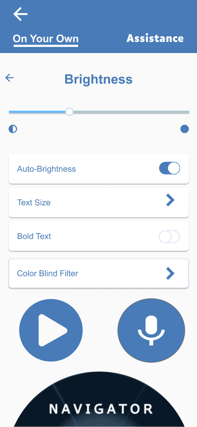
Customize with adjustable text size, fonts, and screen reader support.
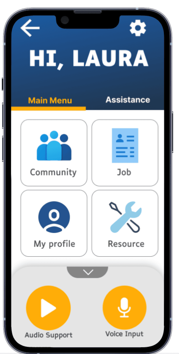
Intuitive four-square layout for quick navigation between key features.
Manage profile with medical preferences, visibility settings, and contact details.
search and filtering options tailored to the needs of visually impaired job seekers.
A vibrant online community for support, mentorship, and peer-to-peer learning.


Access tools like resume builders, interview simulators, and accessibility resources.


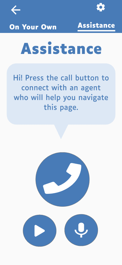
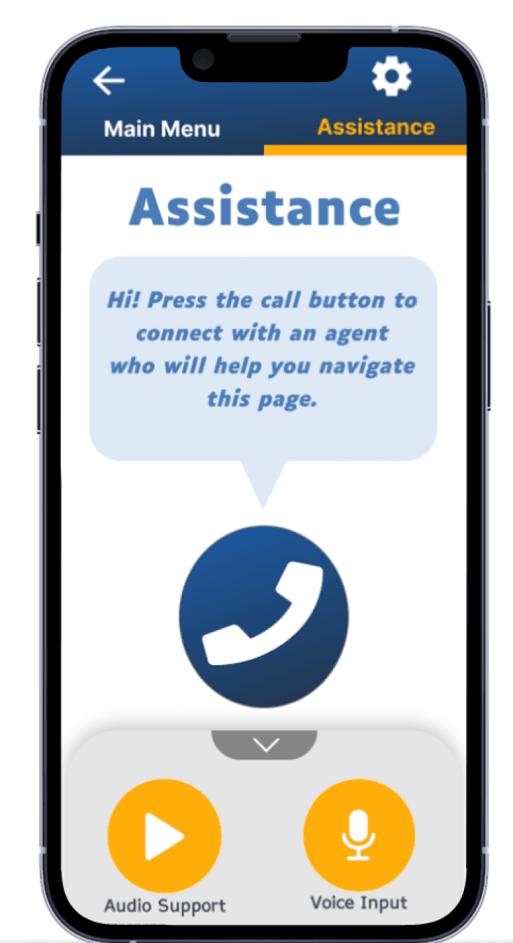
Assistance


Based on valuable feedback from user testing and interviews, we iterated on our initial low-fidelity designs. This process led to key adjustments and enhancements, ultimately creating a more user-friendly and intuitive experience.
LOW-FIDELITY
Login Menu
Home Menu
Navigator
Login page with voice input and info icons for enhanced accessibility.
Retained the 4-square layout based on positive user feedback for ease of use and navigation.
This keeps it brief while highlighting the key features. Does this work for you?
Radial menu allows users to swipe or hold to select options. Faster and easier to memorize than standard list menus.


Users can post questions or scroll through and respond to the feed..
Customization options let users tailor settings to their impairment and optimize app interaction.
Search and filter job positions tailored to user needs.
Community feed lets users swipe through posts on jobs and networking events from various users.
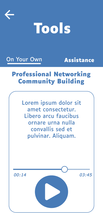
Tool selection explains available resources. Press play for an audio description of each tool.
Audio Description: The play button or screen reader will describe the content


Community Menu
Settings
Profile
Job Search
Community Feed
Tools
Audio Description
Profile menu lets users edit personal details, medical preferences, and control visibility for employers
TypeFace & Design Choices

The four-squared layout and radial menu make navigation easy, while voice input, icons, and audio descriptions cater to diverse needs.
The Community section fosters connection, and the Tools section provides helpful resources. Using the readable Luciole font, Visionary ensures a comfortable experience, especially for low-vision users.
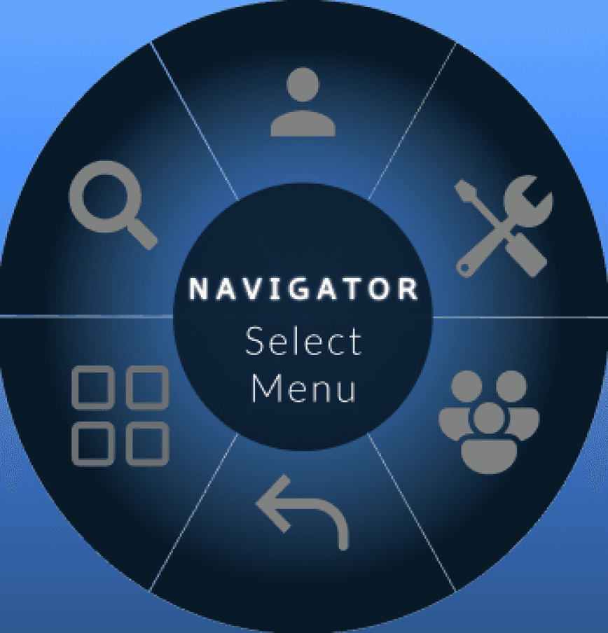

When Touched down
Or swiped
Normal State

This is the final design, refined and polished after multiple iterations and incorporating user feedback from Maze Testing.





FINAL DESIGNS

RETROSPECTIVE
This project was a significant learning experience, particularly in understanding the nuances of accessibility design and its impact on user experience
Key Takeaways

User Feedback Is Essential

Multi-Sensory Design

Simplicity & Clarity Are Key

Accessibility Is Paramount